We all make mistakes. It’s easy to have an error on a spreadsheet, send an email to the wrong recipient or miss a typo before an item goes to print. In most cases, quick action and an apology can go a long way. But sometimes that might not be enough, especially when the mistakes are, simply put, big ones. And when the big mishaps occur, the impact can be terribly embarrassing, highly detrimental to the brand and incredibly costly.
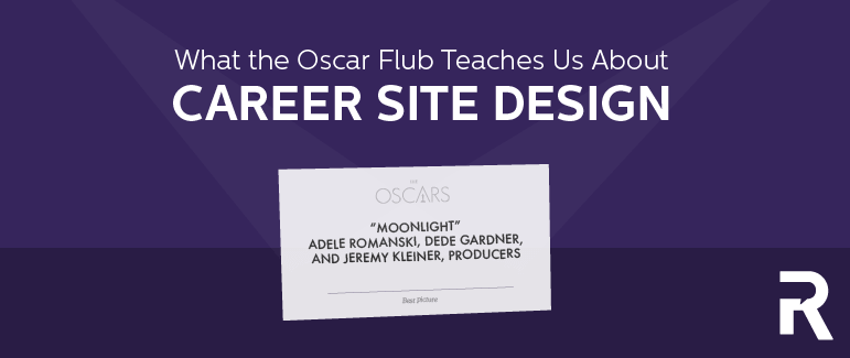
The 2017 Oscars may have been less watched than in previous years, but it’s still making headlines. The confusion and error over the “Best Picture” award and who’s to blame has generated much fodder and even conspiracy theories across social media. The design community, in particular, has vocalized how poor design was the ultimate culprit.
Source: ABC News
What were the problems?
Proposed design solutions address each of these issues and suggest that the error would have been immediately noticed by the presenters before announcing the wrong winner.
Fortunately, we don’t typically make the kind of mistakes that get aired in front of 32.9 million viewers. For better or worse, errors of this scale get noticed. But what about the mistakes that don’t get noticed, and as a result don’t get fixed? What can those mistakes be costing you? And how big can they get?
What does the Oscar controversy teach us about career site design?
For anyone who watched Warren Beatty’s face, it was clear that he was confused after seeing the card. In fact, it was his presenting partner, Faye Dunaway, who ultimately read the card when Beatty showed it to her after looking at it multiple times but refusing to read it.
Too often, application processes are confusing, and candidates are unsure where to start or what to do. In the cases of yes or no questions, candidates may wonder which is the “right” answer and whether to try to “game the system” to ensure their application is reviewed. Other times, there is no clear “right” answer, as in the example below where the choices are “Accept” and “Decline” but the question is missing entirely. It’s not always so obvious, but sometimes candidates are forced to select a choice in order to move forward, when none of the available answers seem accurate.
Note: The screenshot is real, but the logo has been updated for anonymity
The best career sites and application processes make the path to apply easy and clear for their candidates. They help candidates immediately find the information and jobs that are most relevant, leaving out any guess work. In the following example on the Oakland Unified School District career site, OUSD identifies the three audience groups coming to their career site: Current Oakland Job Seekers, Relocating Job Seekers and Current Employees. Each of these candidate groups is directed to information specific to their job search and common questions.
Source: Oakland Unified School District
Announcing the winner or realizing the error should have been obvious, but it wasn’t. In part, the typography issue made the announcement difficult for the presenters. When websites are poorly designed, visitors are left doing the extra work. According to author and consultant, Patrick Lencioni, “If everything is equally important, nothing is important.”
Your career site should provide an effortless candidate experience. Make it easy for job seekers to understand the content you are sharing and how to get to the information that is relevant for their journey. Start by highlighting what’s really important when developing your career site content. That means sharing the information that candidates want and need to know, and making it clear what actions you want candidates to take. Keep copy concise and leverage headlines and imagery to tell your story. Use strategic placement and different sizes for headlines based on their level of importance.
And above all, make it easy for candidates to find your jobs and apply. Avoid distracting your job seekers with other actions. In the example below, the most prominent call-to-action is the “Email Job” button and the “Apply” button is listed third after two other buttons that direct visitors away from the current task of applying.
Note: The job posting is real, but the information has been updated for anonymity
Help your career site visitors by showing them what’s most important and which action to take next. In the example below, the apply button is the most prominent call-to-action on the page.
Source: Enterprise Select
If the wrong envelope had not been handed to the Oscar presenters, the design of the announcement cards would most likely not be a controversy. Whomever designed the card presumably did so with the best of intentions and thought it easily got the job done. Ultimately, these critical details mattered, showing that although something may make complete sense to you, it is important to be prepared for and aware of perspectives that differ from our own.
As recruiters and hiring managers, we may see our applications as easy to complete, thinking: “Well, it’s basic information and only takes 15 minutes.” To a job seeker with a full time job, spending an hour looking for jobs each evening and applying to 3-5 positions, 15 minutes is a lot of time to invest. And in most cases, candidates don’t know how long an application will take prior to beginning.
And sometimes in our effort to be clear and efficient in setting expectations, we miss the mark and turn off our candidates in the process.
Exhibit A: The easy “three-step process” where step one might take 30 minutes to complete.
Note: This is a real application process
Exhibit B: The hard-to-fill job posting that tells candidates, “Don’t call us, we’ll call you.”
Note: The job posting is real, but the information has been updated for anonymity
So while it is important to be transparent about the process, it’s also critical to recognize the perspective of our audience. Consider how your career site, your application and your hiring process appears from their point of view and whether they feel valued. Data shows that employers who invest in a better candidate experience and appreciate their time and effort see the results payoff in dividends.
You probably won’t be responsible for handing out the most coveted award on one of television’s most watched nights anytime soon, but the responsibility for hiring the people who drive your business is a big one. The opportunity to learn from one of the most widely watched mistakes of the year, leaves us with a few reminders of the impact created by experience and design. When we take the time to reconsider our process, message and delivery, it provides us the chance to self reflect on the way that design and experience influences and impacts the decisions people make—and as a result, the outcomes we receive.
After all, it can make a big difference.
Source: Fast Company